- Christopher Doyle & Co
- Australia
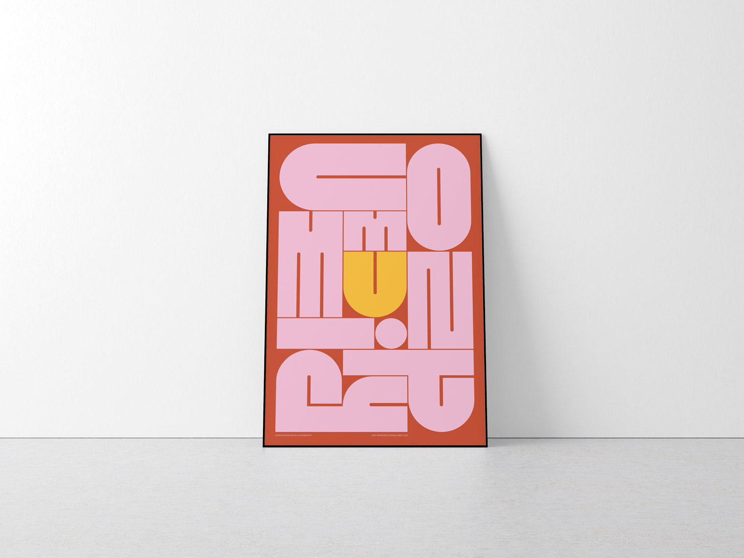
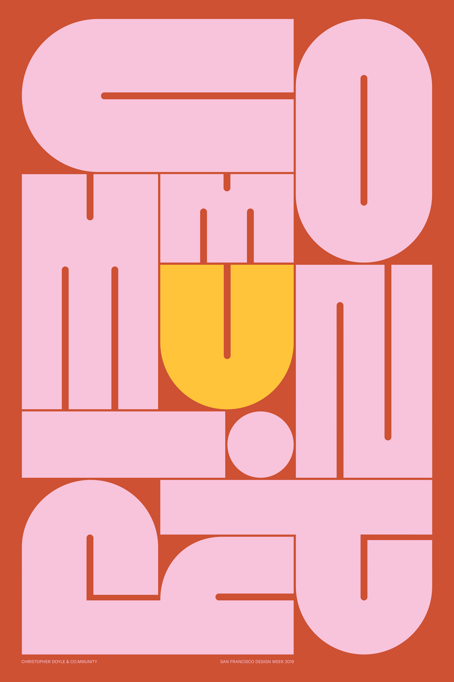
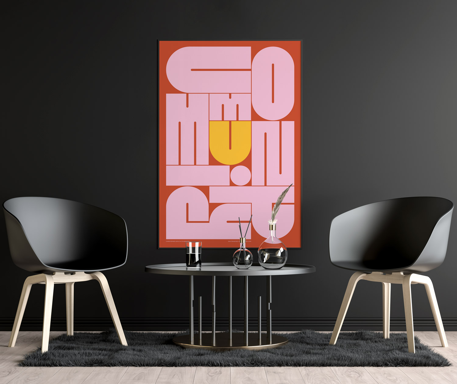
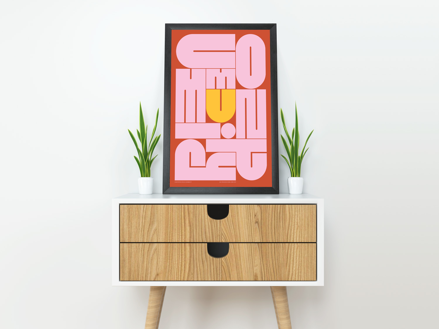
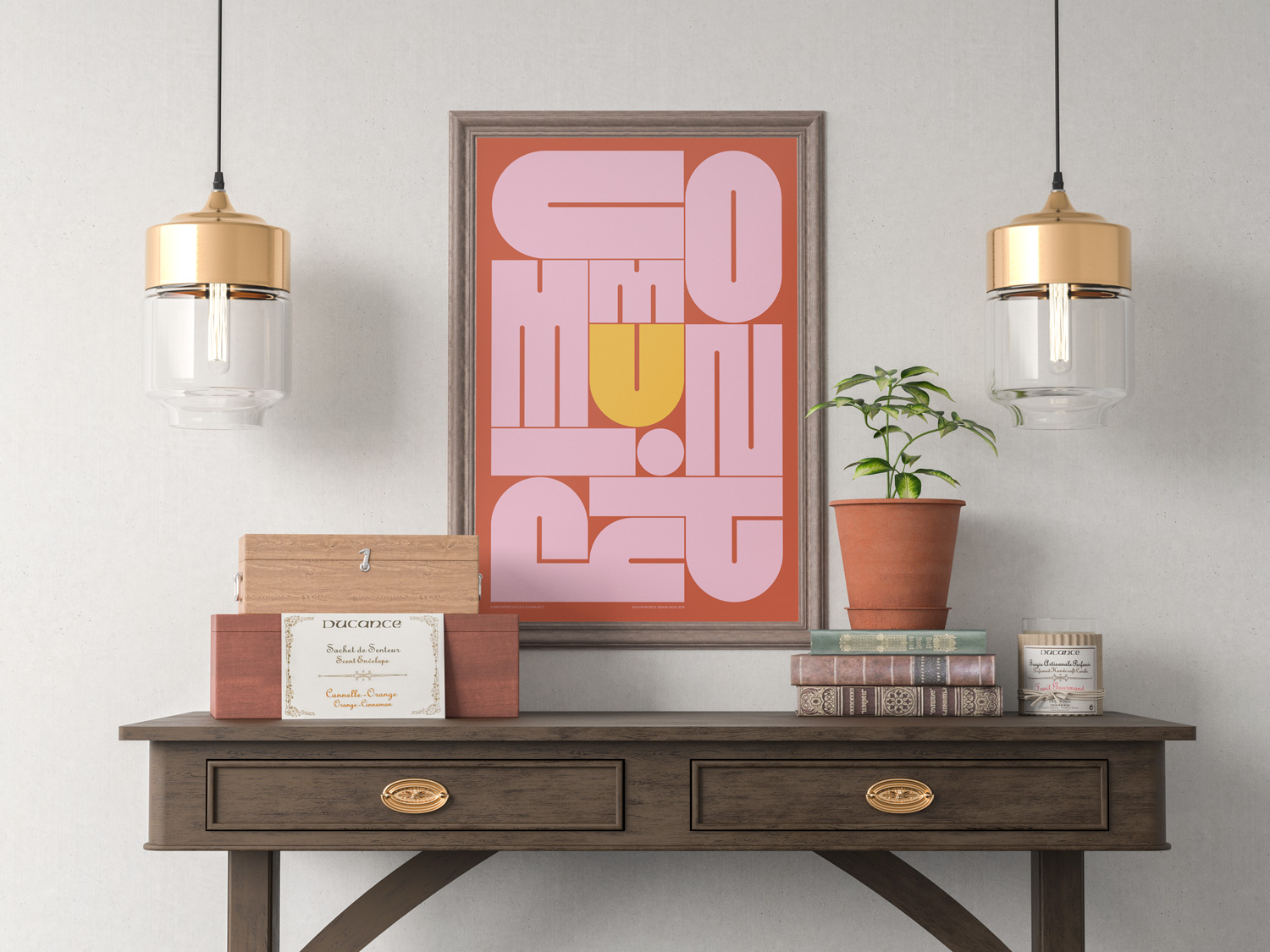
CommUnity
We wanted to use type to convey the ideas of acceptance, safety, and support that come with the true community. Throughout the process, we also discovered the letter U could live at the very center of the arrangement, and that a simple color change could highlight the individual's place and role in the design, and thus the community.
Creative Director: Christopher Doyle
Designers: Wilson Leung, Emily Sneddon
- Only 15 numbered prints are available. Use the dial to choose the edition of your print.
-
Printed 24" x 36" on Hahnemühle Photo Rag 308gsm (100% Cotton Rag paper)